Building Connections That Stick: Designing BeeBack
A customer loyalty platform that helped small businesses turn casual visitors into regulars.
Role
- Co-Founder
- Creative Director
Team
- Founding Team
- STEM
- eLearning
- SaaS
Focus Areas
- UX Research
- Product Design
- Mobile Design
- Design System
- Accessibility Design
Overview
BeeBack started as a simple idea: helping local businesses reward loyal customers in a digital-first world.
As physical punch cards faded away, BeeBack provided a seamless mobile solution that combined loyalty rewards, communication tools, and analytics into one intuitive platform.
As Creative Director and Co-Founder, I led the design of the brand, product, and entire user experience — ensuring BeeBack felt approachable to business owners who weren’t always tech-savvy.
The Challenge
Small businesses often rely on loyal customers but struggle to build repeat engagement without complex systems or expensive software.
Our challenge was to design a loyalty product that was:
Simple enough for a small café to set up in minutes
Engaging enough for customers to keep coming back
Scalable for larger retail networks with multiple locations
We didn’t just want to gamify loyalty. We wanted to build genuine, long-term relationships between businesses and customers.
Jas Gill, CEO, BeeBack
We needed to design an experience that:
- Encouraged students to learn through practice, not fear mistakes
- Provided learning modes that mirrored how students thought & worked
- Helped instructors visualize student thought processes
- Worked seamlessly across desktop, tablet, and mobile
- Maintained pedagogical integrity across Prealgebra through Precalculus
Discovery & Research
I collaborated with our Product Manager and joined multiple user interviews with instructors and students. While I didn’t directly lead the sessions, I participated in observing user behavior, taking notes, and later reviewed and synthesized the collected data to identify recurring patterns.
I also worked closely with subject matter experts (SMEs), such as professors and math curriculum designers, to ensure the product aligned with both pedagogical best practices and real classroom needs.
Key Insights
Cognitive overload often came from unclear steps or lack of context.
Students wanted reassurance — real-time feedback, hints, or small wins.
Instructors needed visibility into each student’s process, not just outcomes.
Consistency in layout and math entry improved confidence for lower-level students.
"Students often defaulted to paper because they didn’t trust the system to help them think through math."
Tom Khulesa, PM, Aktiv Mathematics
The Design Process
01 — Defining the Learning Modes
To support different learning approaches, we designed three modes that scale with student mastery:
Scaffolded Mode — Step-by-step guidance for building foundational skills
StepWise Mode — Students show reasoning with targeted feedback after each step
Final Answer Mode — Standard input for summative assessment and mastery
Each mode was designed to feel consistent yet distinct, with subtle interface and interaction variations that matched cognitive complexity.
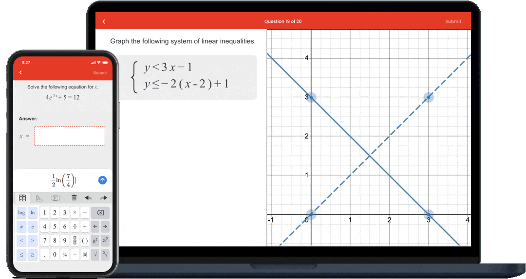
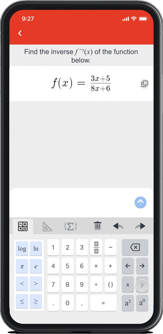
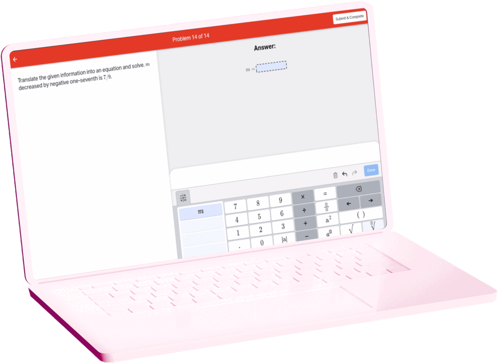
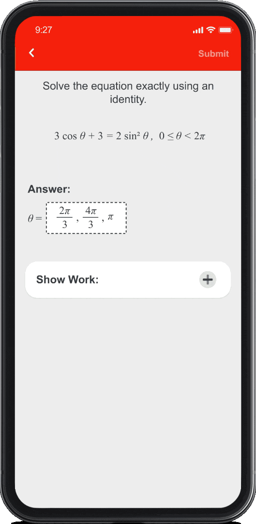
02 — Math Input and Feedback
We simplified math input interactions, focusing on clarity and flow:
Equation editor supports fractions, radicals, and exponents with natural keyboard entry
Graphing tool (powered by Desmos integration) provides real-time visualization
Feedback bubbles appear inline to guide corrections, not penalize errors
03 — Instructor Experience
Instructors can now:
View step-by-step student reasoning for deeper insight
Track class-level analytics and trends
Configure assignment settings and difficulty across learning modes
I designed these instructor dashboards to feel less like spreadsheets and more like visual stories of student learning — showing progress, confidence levels, and areas for reteaching.
Collaboration with Experts
Working with subject matter experts was crucial. Together, we reviewed question types, problem structures, and interface patterns to ensure every interaction reflected sound mathematical reasoning.
For example, SMEs helped validate Scaffolded Mode interactions to ensure they matched instructional logic used in real classrooms. This close loop between pedagogy and UX helped make the product truly “teacher-approved.”
Results & Impact
- Used in hundreds of universities and K–12 bridge programs
- Higher student engagement and lower frustration in formative topics
- Improved instructor visibility into student reasoning processes
- Positive feedback from faculty on balance between usability and rigor
-
Received Patent
(US Patent #: 12,198,567 B2)
Takeaways
Designing Aktiv Mathematics reminded me that learning tools must respect the way students think; messy, iterative, and nonlinear.
What I learned
Balance pedagogical depth with interface simplicity
Collaborate deeply with subject matter experts for domain authenticity
View error states as part of the learning process, not obstacles to avoid